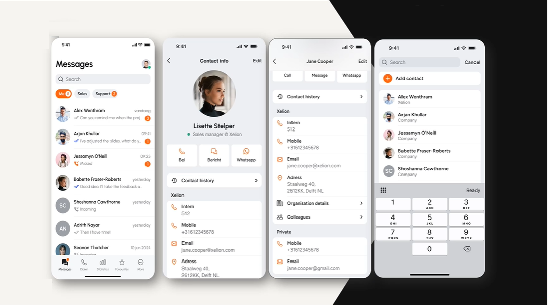
Xelion has unveiled a new look, including an updated user interface for its communications platform, new branding and a revamped website.
The new website was revealed to partners on earlier today at the company’s partner conference in the Hague, Netherlands.
The transformed user interface (pictured above, in dark mode) is scheduled to go live to all users on the 21st of October.
The new look is designed to complement the broader rebrand and enhance the user experience. This includes updates to both the mobile app, the Windows app and the browser experience.
Thijs van Ende, CEO, Xelion, said, “I am delighted by the new look. Xelion is an incredibly powerful modern solution for modern businesses. Our new branding reflects that, and our partners and users around the world will love it.
“We are continuing to grow as one Xelion, from the Netherlands to the UK, Germany, Belgium and beyond. We’re investing in people, infrastructure and development, and now we’ve matched that by investing in our brand.”
Dave Reynolds, managing director, Xelion UK, added, “This is an incredibly exciting step for us to take as a business, and it will have direct benefits for our brilliant UK partner network.
“The interface looks amazing, and it’s not just about appearances – it makes the user experience even better and will help our partners keep winning more customers.
“We’re as committed as ever to our partners, and to providing the most feature-rich, resilient platform possible. Now, the style lives up to the substance. I can’t wait for the first demo.”
The project was a collaboration between the company’s marketing, development and leadership teams in the Netherlands, UK and Germany.

