The update aims to make it faster and easier for users to understand what is happening across multiple network technologies.
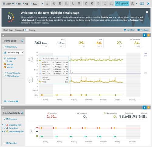
The platform has new and enhanced charts (example in the image below) that enable users to view performance by month, day or hour.
Users can zoom into the charts to see granular and precise details about the health, load and stability of their network covering SD-WAN, 4G/5G mobile, Internet, Ethernet, MPLS and Broadband connections.
Steve Hobbs, lead UI designer, Highlight, explained, “Whilst the upgrade gives Highlight a fresh and modern user interface, more importantly, the new capabilities make it faster for our users to determine how their networks are performing and identify any areas with issues.
“The new dynamic charts follow a natural and logical progression, offering improved functionality and making them easier to use. The upgrades also make maintenance and improvements to the platform more efficient and faster for our in-house development team.”
Highlight’s new charts offer an insight into the precise timing of events so that issues can be identified quickly. Users can review line health to determine how hard a router is working as well as hover over a chart value to see traffic loads as an actual reading or as a percentage against thresholds. They can also see when a circuit is down and when it has been restored.

